Les traboules de Lyon
Branding
Web design
2024
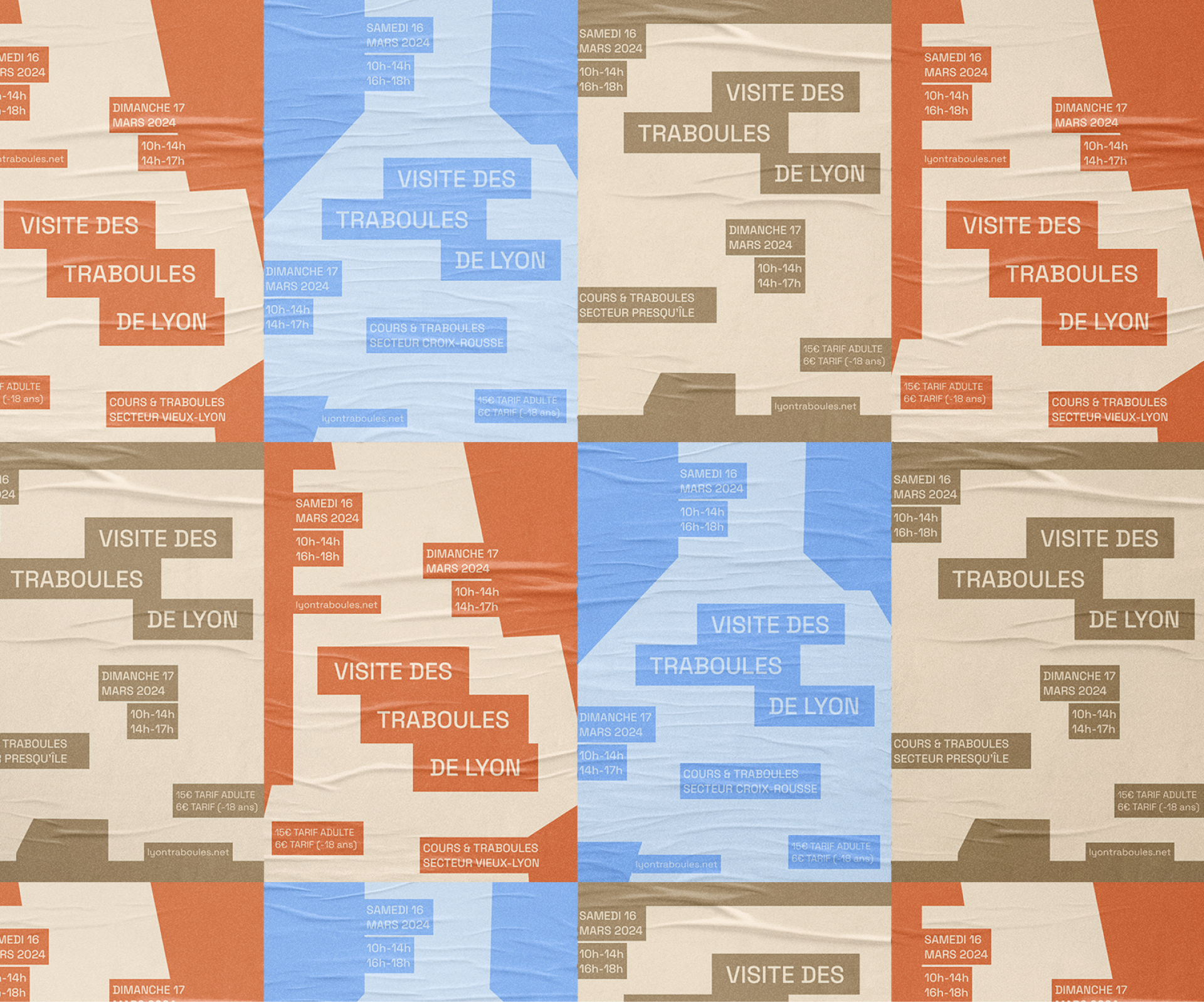
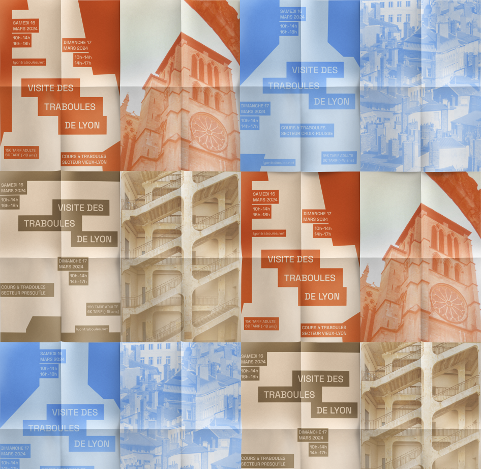
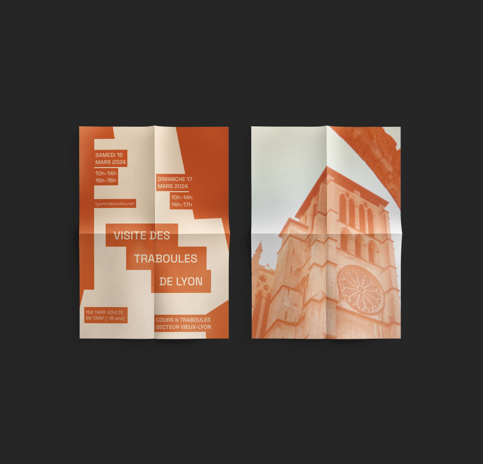
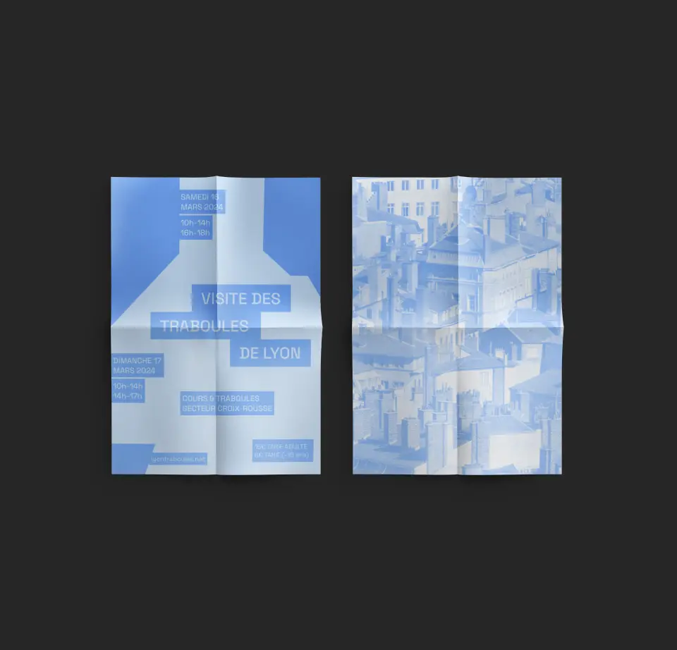
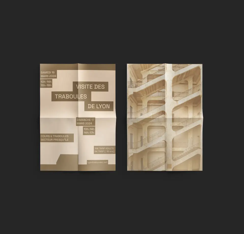
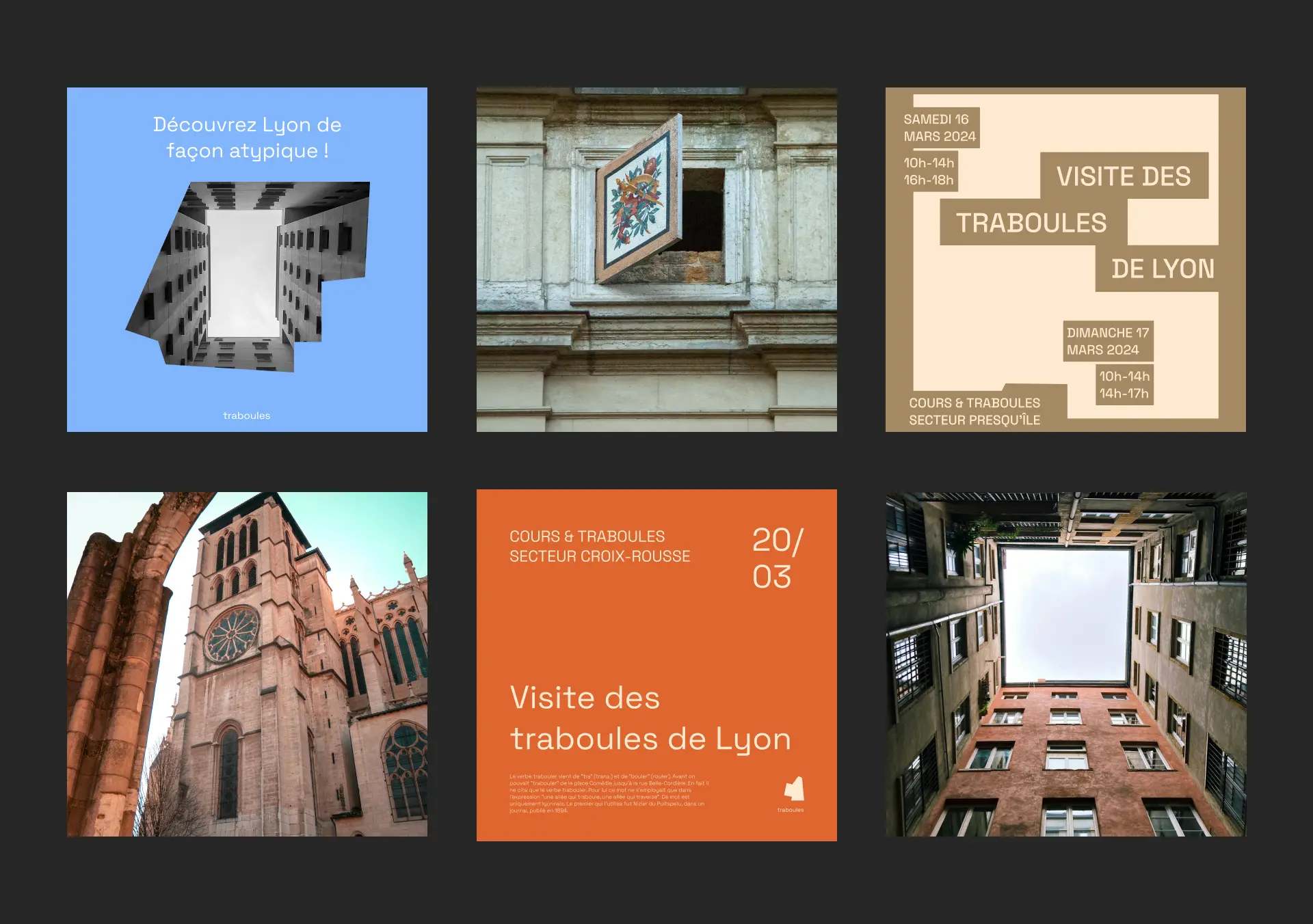
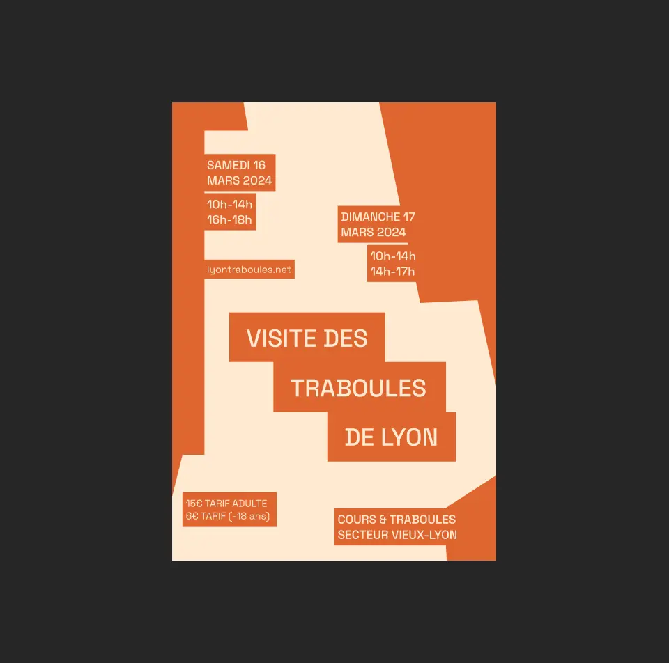
Les traboules de Lyon is a Lyon agency which promotes guided tours of the traboules and courtyards, or more commonly called the network of secret passages in Lyon. To give this agency its own universe, I explored the architecture of traboules and based the identity on a fun, modular and colorful visual system.
THE CONCEPT
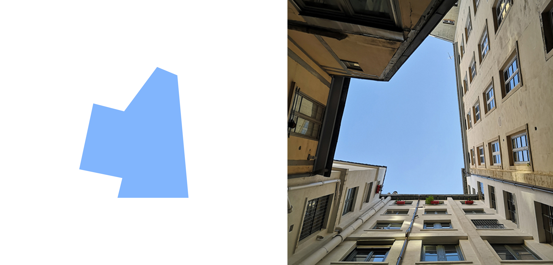
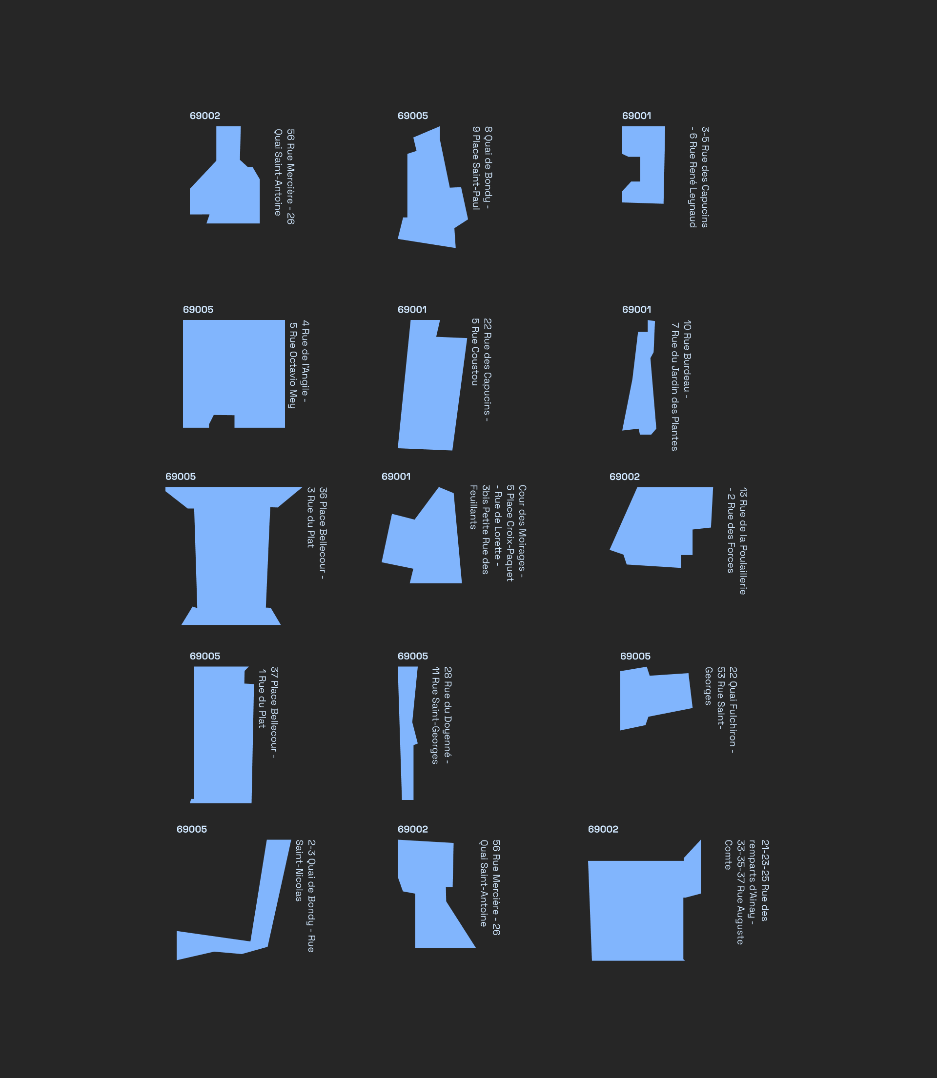
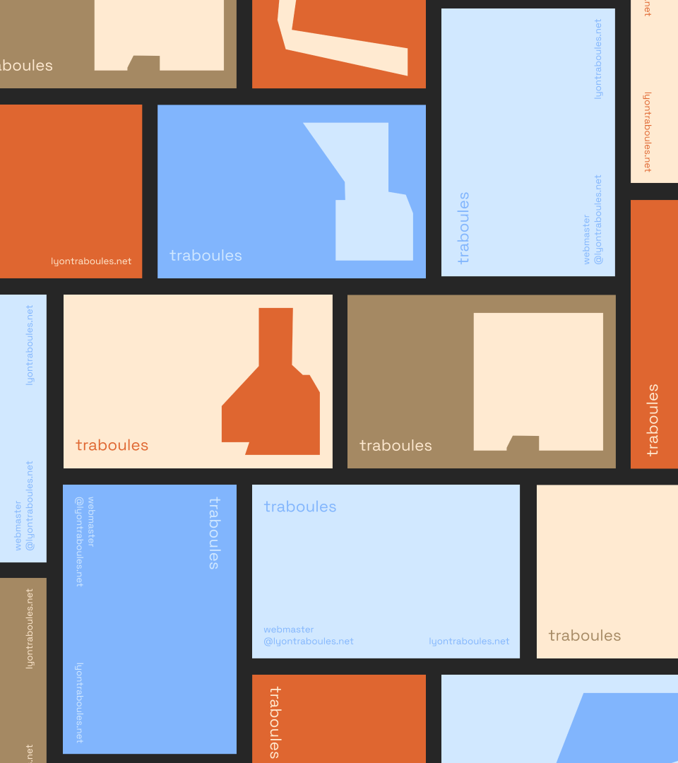
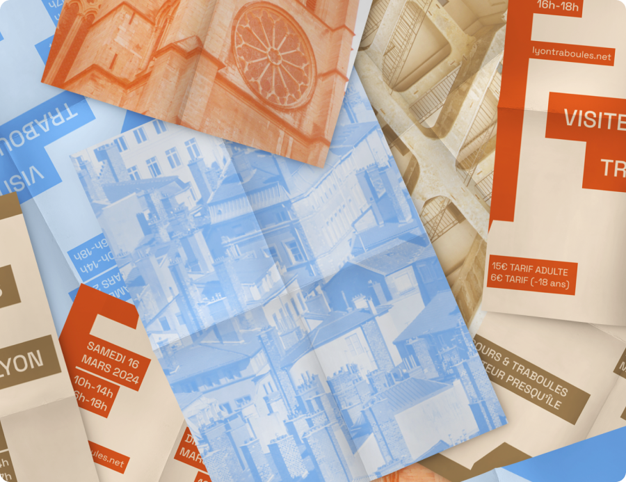
The graphic principle is based on the geometric shapes formed by the courtyards of buildings where the traboules are nestled when you look up.The identity is scalable and adaptable to all formats and for all traboules. It integrates a historical dimension into a contemporary event.
BRAND IDENTITY
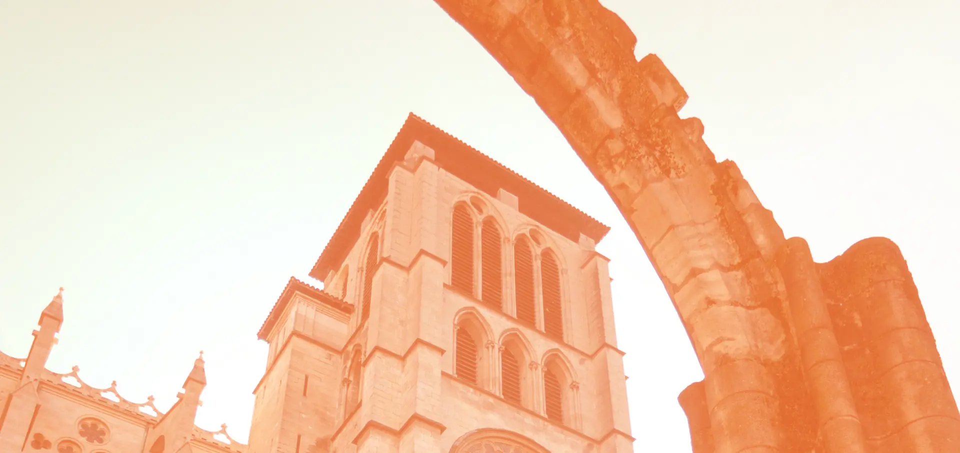
The color palette is made up of 3 main colors: blue representing the sky which can be seen in the courtyards of the traboules between the buildings, beige and orange which are the typical colors of the facades of buildings in the Old Town sectors : Lyon, Croix-rousse and the Presqu’île
